Virgin Atlantic
When we redesigned the Virgin Atlantic website, the goal wasn’t just to make it look pretty—it was to make it work. Websites aren’t just places to click—they should tell a story, seduce, and sell. At Virgin, that’s kind of their whole modus operandi. They aren’t just an airline—they’re a promise of adventure, luxury, and boldness. So, we stripped away the noise. Big, clean visuals make you feel like you’re already in the air. Clean typography that speaks with confidence. Every detail focused on connection—between the brand and its customers, and between a dream destination and the person dreaming about it.
THE CHALLENGE
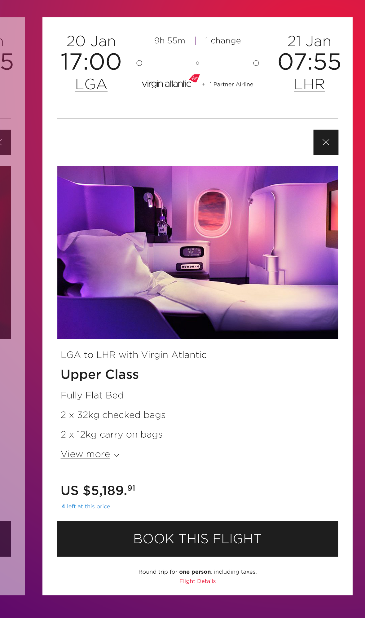
Virgin Atlantic isn’t just another airline. It’s a brand built on boldness, personality, and an unapologetic commitment to doing things differently. But their digital experience? It wasn’t living up to that reputation. The website and mobile app felt disconnected—clunky booking flows, inconsistent design, and a user experience that didn’t match the excitement of stepping onto one of their planes.
The goal was clear: create a seamless, visually striking, and intuitive digital experience that made booking a flight feel as effortless as sipping champagne at 30,000 feet.
THE PRECISION APPROACH
A redesign isn’t just about making things look better—it’s about making them work better. Leading this project meant rethinking how travelers interact with Virgin Atlantic online, from the first search to check-in at the gate. Here’s how we did it:
1. A UNIFIED, BEAUTIFULLY FUNCTIONAL DESIGN
• Created a cohesive design language that worked seamlessly across web and mobile.
• Modernized the look with clean typography, bold visuals, and intuitive layouts—everything with that signature Virgin flair.
• Designed with motion in mind: subtle animations and transitions that made interactions feel smooth, not sluggish.
2. A BOOKING & CHECK-IN EXPERIENCE THAT JUST FLOWS
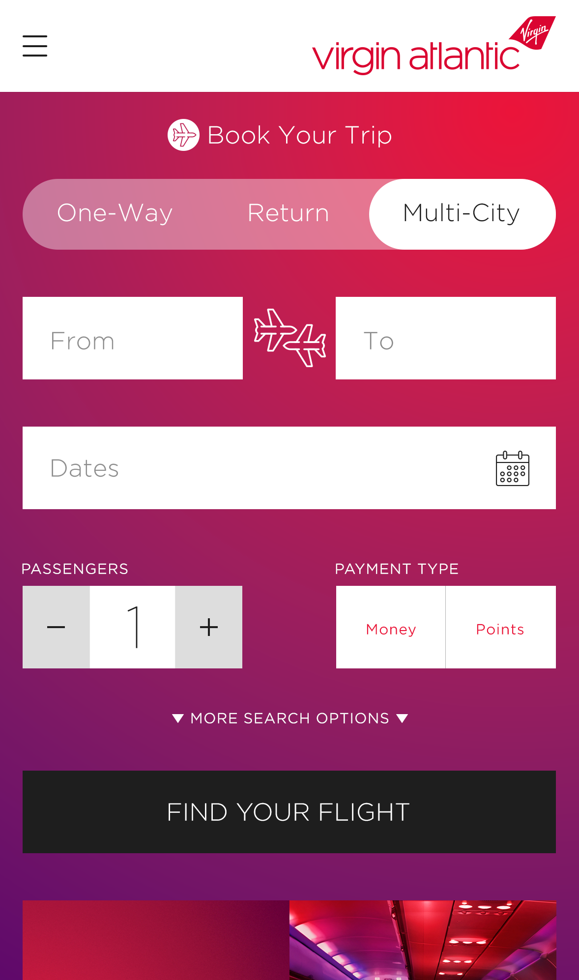
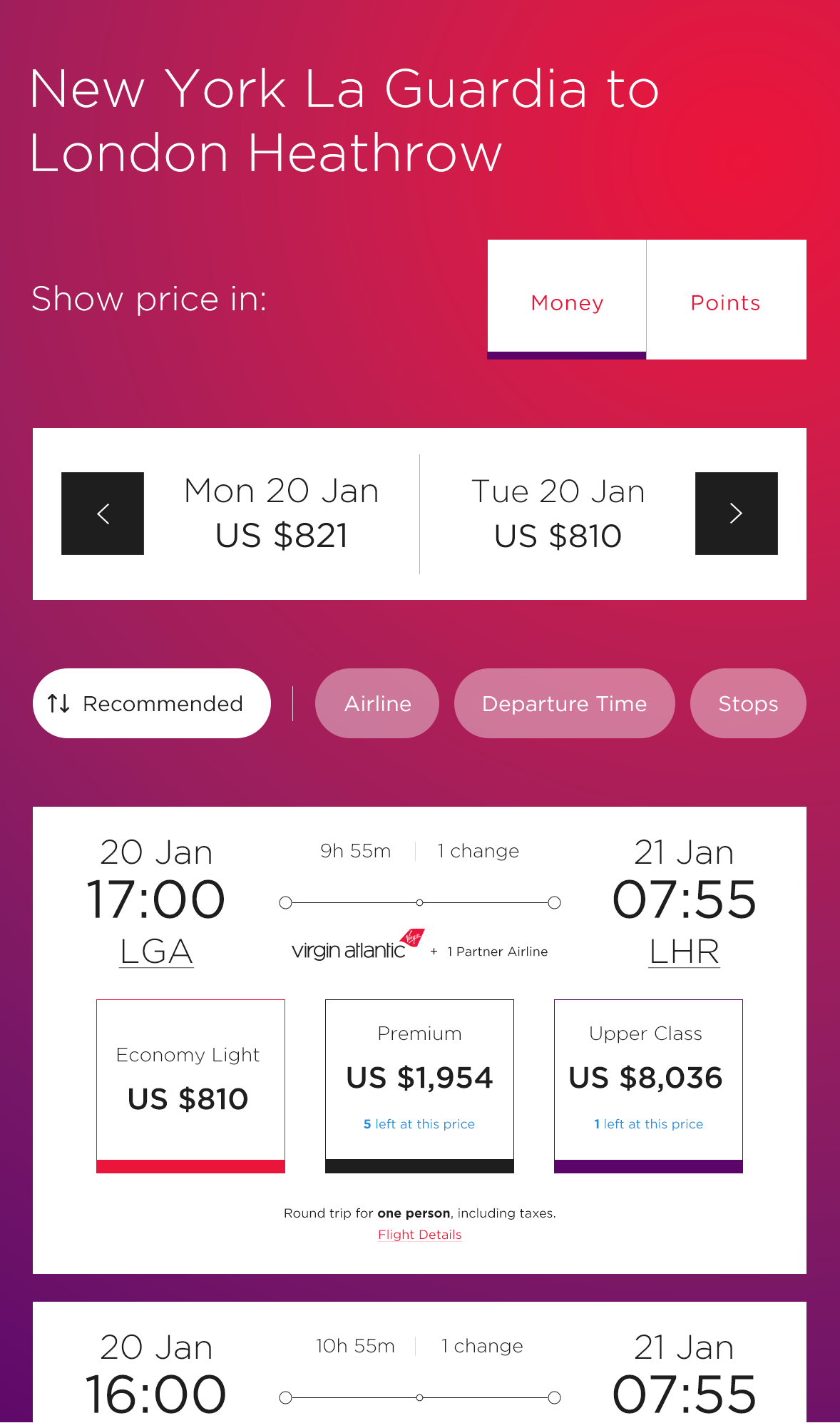
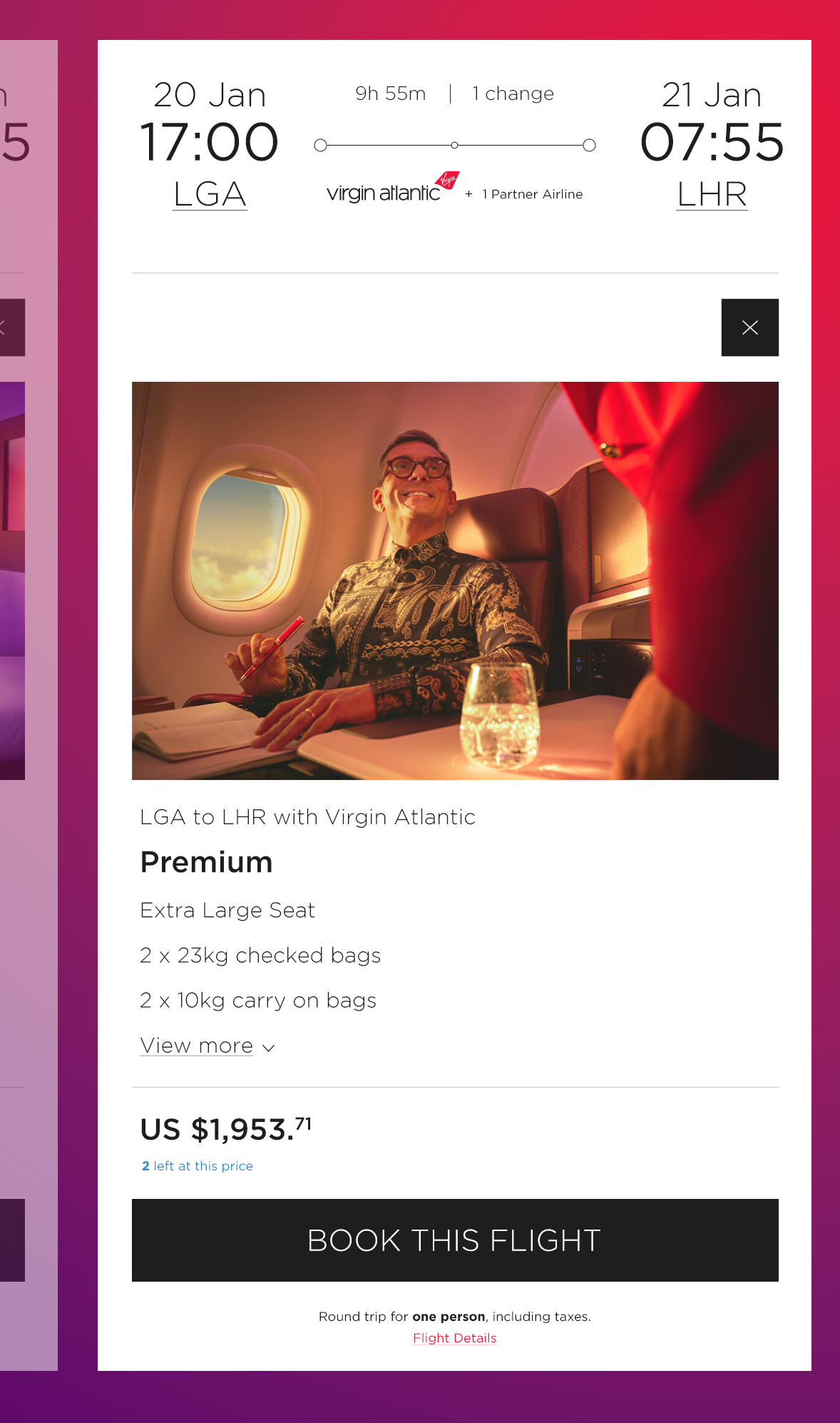
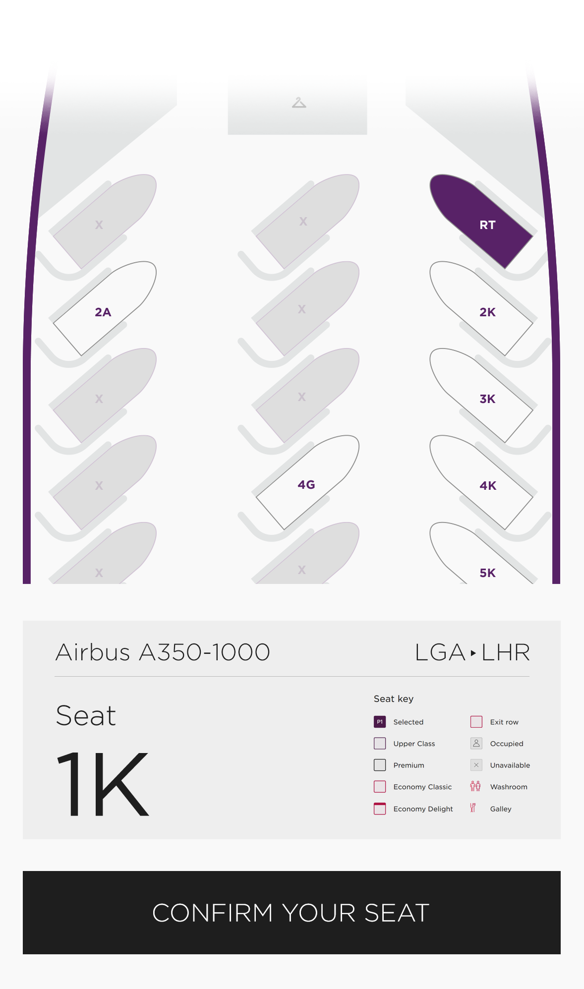
• Cut out the clutter—simplified the booking process to reduce friction and decision fatigue.
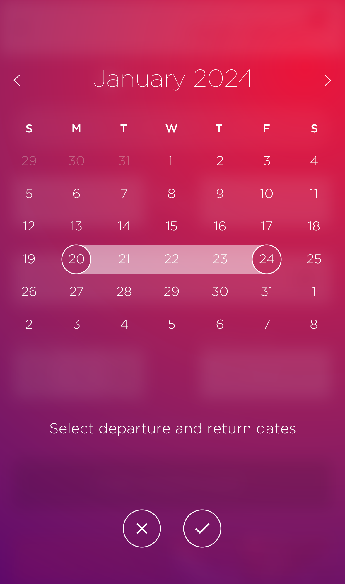
• Built a smarter flight search that let users find exactly what they needed—fast.
• Made check-in seamless, integrating biometric options and one-tap mobile boarding passes.
3. PERSONALIZATION THAT ACTUALLY FEELS PERSONAL
• Designed a personalized dashboard that put the most important trip details front and center.
• Integrated real-time flight updates, loyalty rewards, and destination-specific content.
• Thoughtfully placed upgrade and add-on opportunities—never intrusive, always useful.
4. PERFORMANCE & ACCESSIBILITY FIRST
• Optimized for speed because no one likes waiting (especially not in a browser).
• Designed with accessibility in mind—better contrast, intuitive navigation, and screen-reader support.
• Ensured the mobile app worked flawlessly, even on less-than-perfect network conditions.
THE OUTCOME
The new Virgin Atlantic website and app weren’t just improvements—they were transformations. The results spoke for themselves:
Higher conversions—a smoother booking flow meant more completed reservations.
Happier travelers—users loved the streamlined navigation and visual polish.
A stronger brand presence—the digital experience finally matched the in-flight experience.
Increased mobile engagement—the app became the go-to tool for managing trips.
At the end of the day, this project was about more than pixels and UX patterns—it was about bringing the Virgin Atlantic experience to life before passengers even stepped on the plane. And that’s exactly what we did.
© 2025 Kevin Blackwell.


